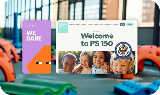
PS 150’s previous website lacked cohesion, accessibility, and warmth. The design felt outdated, and the user experience didn’t reflect the energy and inclusiveness of the school community.
Improve site navigation and engagement for parents and students.
03
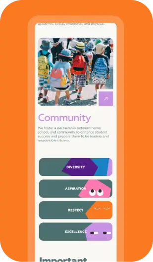
Create visuals that capture creativity, diversity, and connection.
04
Develop cohesive branding across all touchpoints, from web to print.
Solutions We Offered
To achieve PS 150’s goals, Poirier Agency delivered a complete creative overhaul focused on brand unity and digital engagement. Our services included:
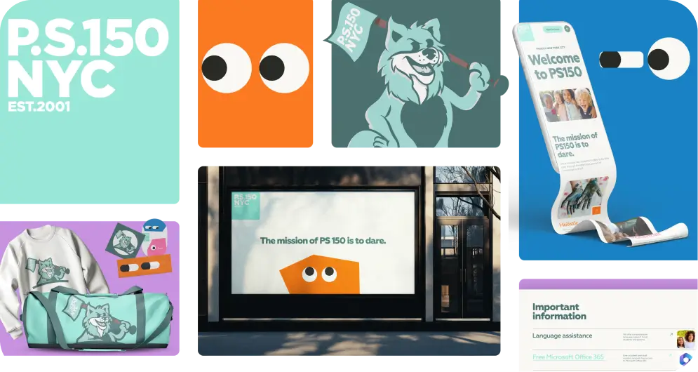
Logo Redesign
Branding Design
Website Optimization
Web Development
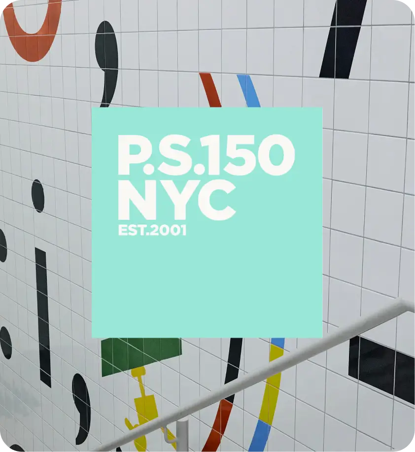
Logo Redesign
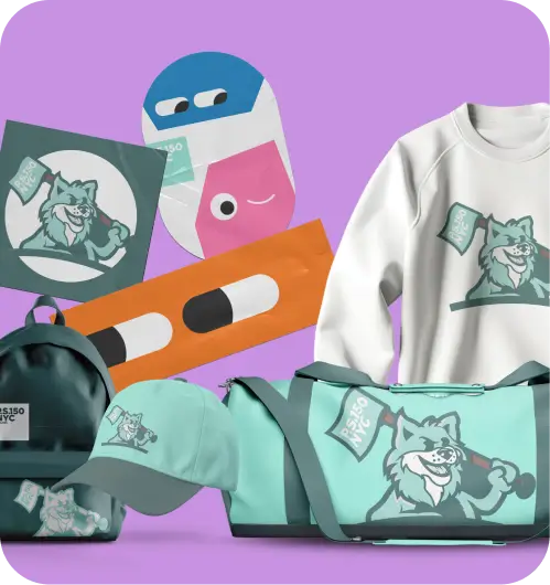
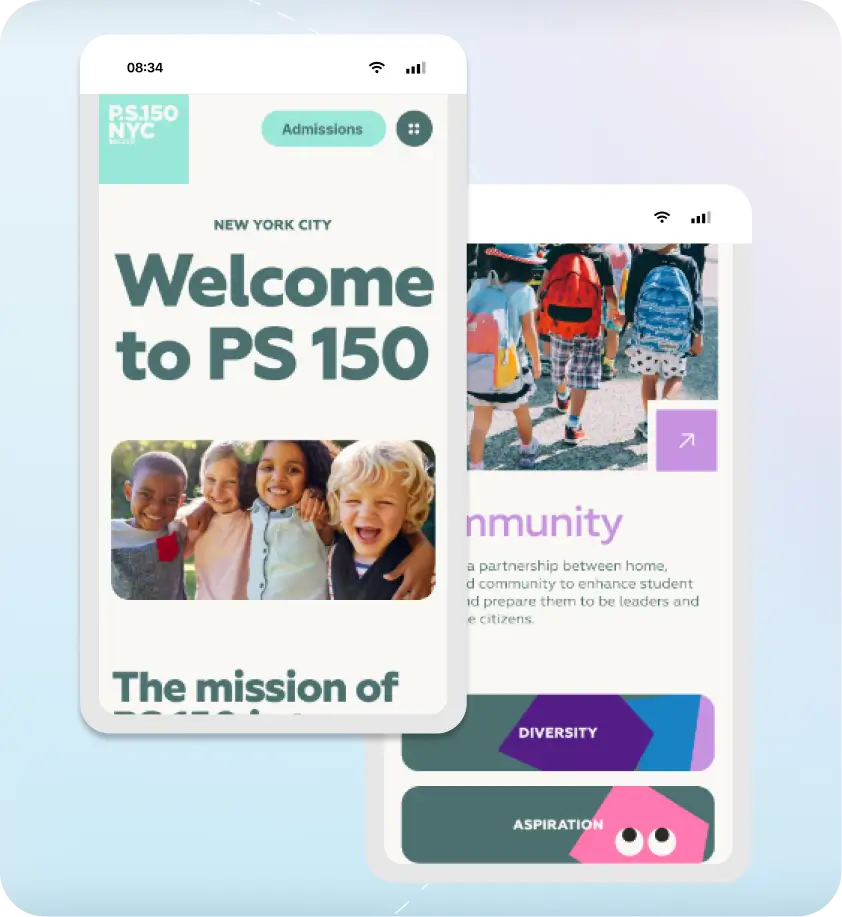
We modernized PS 150’s logo to capture the school’s bright, inclusive personality. The refreshed design balances professionalism with playfulness, creating a mark that students, staff, and parents can proudly represent.
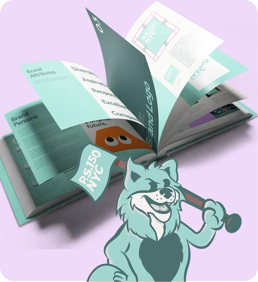
Branding Design
Our team built a cohesive brand identity centered on color, typography, and tone. The result is a friendly and consistent visual style that connects PS 150’s digital presence with its real-world community.
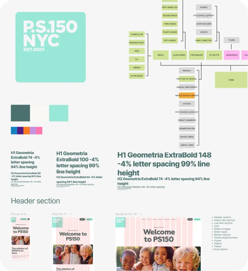
Website Optimization
We enhanced usability and accessibility by improving load times, navigation, and responsiveness. These updates made the site easier to explore for both students and parents, across every device.
Web Development
From structure to functionality, we rebuilt PS 150’s site for long-term performance. The new platform enables simple updates, flexible content, and seamless integration with the school’s expanding programs.
Clients That Trust Poirier Agency
Socarrat
Working with Poirier Agency has been a game changer! They deliver high quality results with a strong strategic data-driven approach to SEO and excellent customer experiences. Overall, a pleasure to work with and we recommend them as the best digital marketing agency in NYC!
Ai Hirakawa
Arcara Psychiatry
I had the pleasure of working with Poirier Agency recently, and I couldn’t be happier with the results. Their team’s expertise, creativity, and dedication to our project exceeded our expectations. They not only understood our brand but also helped us reach a wider audience and achieve our marketing goals. I highly recommend them to anyone seeking a professional and effective marketing partner.
Mariela Mendez
Beckmann Surf Academy
Awesome group of people. Always prompt and very professional. Anytime I ask a question they are happy to answer or help find the answer.