Avaia Nutrition  Case Study

Poirier Agency transformed Avaia Nutrition’s digital presence, aligning its website with the strength, clarity, and premium quality of its product.

The Challenge We Solved

Avaia Nutrition had a strong product and established packaging, but the website did not reflect its potential. The experience felt visually scattered, difficult to navigate, and disconnected from the brand’s positioning.

The site struggled with:

01

Outdated UI

02

Incoherent information flow

03

Weak visual hierarchy

04

Friction in the checkout journey

05

Multiple USPs competing for attention

06

No clear mobile-first strategy

What should have been a simple, confident purchase journey instead felt overwhelming. The goal was to bring structure, clarity, and polish to a brand ready to grow.

Solutions We Offered

We delivered a strategic digital redesign focused on cohesion, usability, and conversion. Our approach centered on refining the experience without disrupting the product identity.

Our team provided:


  • UI and Visual System Redesign
  • UX Architecture and Narrative Simplification
  • Mobile-First Interface Strategy
  • Conversion Path Optimization
  • Premium Product Photography Direction

UI and Visual System Redesign

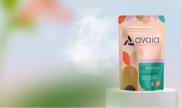
We built a cohesive digital system around Avaia’s existing packaging, allowing the product to guide the palette and tone. Refined typography, balanced spacing, and intentional layout structure created an elevated interface. The result feels clean, aligned, and distinctly premium.

UX Architecture and Narrative Simplification

Avaia’s multiple benefits needed clarity and order. We restructured the content into a focused hierarchy that highlights what matters first, then explains why. The result is a guided, scannable journey that replaces noise with clarity and makes the value easy to understand.

Mobile-First Interface Strategy

Every interaction was designed for small screens first. Simplified navigation, clear calls to action, and streamlined purchase paths create an intuitive experience. Browsing feels effortless, and checkout is smooth, reflecting how modern customers shop.

Conversion Path Optimization

We eliminated friction by reducing clutter and clarifying key decision points. Strategic whitespace, stronger hierarchy, and purposeful CTA placement guide users naturally toward purchase. The journey now feels direct, confident, and built for momentum.

Premium Product Photography Direction

We introduced refined product photography to elevate the new design system. Clean, high-resolution imagery reinforces authenticity and premium positioning. The visuals complement the layout, creating a fresh, airy aesthetic that enhances trust and brand impact.

What We Achieved

Avaia’s website now delivers on the promise of the product.
The shift:


  • From scattered and confusing to structured and cohesive
  • From mixed messaging to a clear, confident narrative
  • From friction-filled browsing to a streamlined buying experience
  • From stale visuals to fresh, premium brand alignment


The new platform feels intentional, polished, and built to convert. It is no longer just functional. It is a true digital extension of the brand.

Clients That Trust Poirier Agency

Connect With Poirier Agency
Go for it...
Not Just Experts. Artisans.

Latest Resources