Poirier Media  Case Study

Poirier Media is the brighter, louder sibling of Poirier Agency, created to give visual and content work its own bold, colorful home.

The Challenge We Solved

We created Poirier Media when it became clear our visual and content work needed its own home to accentuate the work’s creativity. We set out to:

01

Build a digital brand that feels creatively bold and confident

02

Deliver personality and humor without sacrificing professionalism

03

Showcase our visual capabilities by making the brand itself a living portfolio

04

Differentiate Poirier Media from Poirier Agency with clear family resemblance

Solutions We Offered

To bring Poirier Media to life, Poirier Agency developed a full brand and digital system that puts visual storytelling at the center. Every decision, from color and type to layout and UX, was designed to reflect adaptability and expressiveness.

Our team provided:

  • Brand Identity and Color Palette
  • Typography and Visual Voice
  • Logo and Icon System
  • Web Experience and Layout Design
  • Motion and Interaction Design

Brand Identity and Colour Palette

We built Poirier Media around two sun-soaked tones, namely Pumpkin Spice (#FE6B1B) for bold, energetic impact and Soft Linen (#ECE9E1) for calm. The palette instantly separates Poirier Media from Poirier Agency while still feeling related, and makes every touchpoint feel warm and inviting.

Typography and Visual Voice

We chose Neue Machina for its structured forms and sharp ink traps, a typeface with just enough edge to say “we make things.” It balances playful color and layout with a sense of professionalism. The typography anchors the brand so it still feels expert and trustworthy, even when the visuals are having fun.

Logo and Icon System

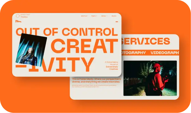
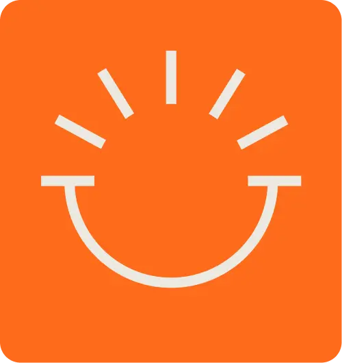
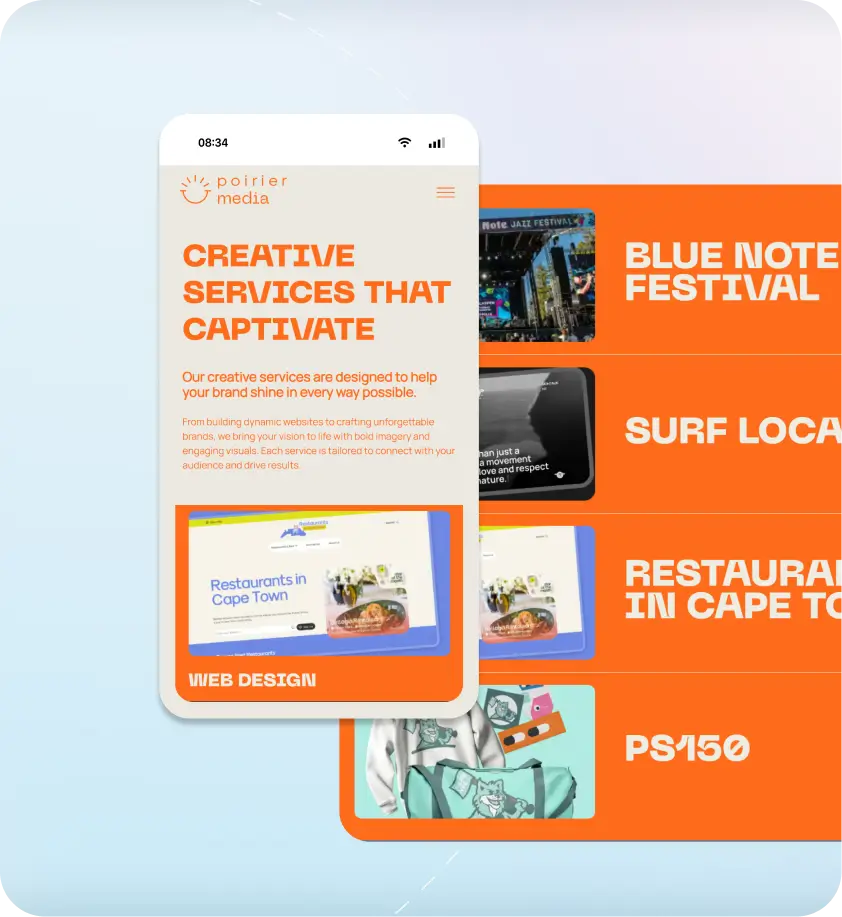
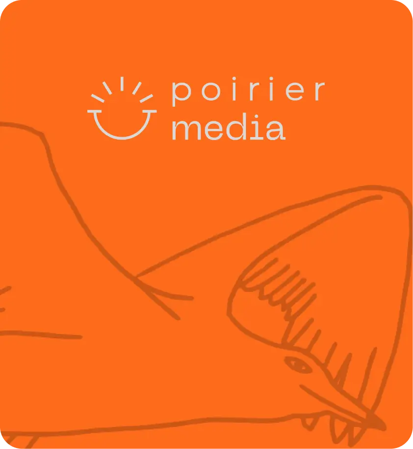
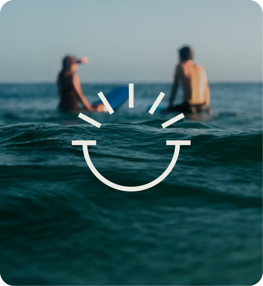
The wordmark stays clean and confident; the icon does the talking. We designed a smile-meets-loading-bar symbol that hints at ideas always “loading,” optimism, and constant motion. The icon works as a quick, ownable marker across the site, social, and motion, instantly recognizable and easy to animate.

Web Experience and Layout Design

Instead of a strict grid, Poirier Media’s site feels deconstructed on purpose. Text and images float, oversized arrows guide the eye, and sections flow like a conversation rather than a template. It feels intuitive and exploratory, encouraging visitors to scroll, browse, and discover more of our work without getting lost.

Motion and Interaction Design

Motion is used as a design tool. Elements lift, slide, and drift into view; subtle bounces and transitions keep the page feeling alive without overwhelming the content. The experience feels like a living studio rather than a static portfolio, signaling that motion and visual storytelling are core strengths of the team.

Clients That Trust Poirier Agency

Connect With Poirier Agency
Go for it...
Not Just Experts. Artisans.

Latest Resources