Home / Case Studies / Rebuilding RC and MH
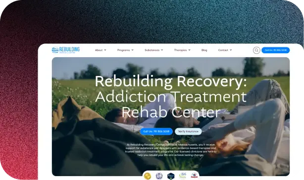
Poirier Agency created a unified, dual-center brand and website experience for Rebuilding that feels calm, human, and easy to navigate.


Rebuilding operates two centers: Rebuilding Recovery Center and Rebuilding Mental Health. They needed to feel clearly connected yet confidently distinct, and a user experience that expressed their warmth, safety, or professionalism.ку
Rebuilding’s goals were to:
Build a shared brand system that unites both centers
Differentiate each center visually without fragmenting the identity
Create a calm, approachable digital presence that avoids clinical sterility
Design intuitive paths to tools, resources, and locations for people seeking care

Starting from a single circular logo, Poirier Agency developed a flexible brand and digital system with shared foundations and distinct color stories, creating a calm, welcoming experience for both centers.
Our team provided:
We expanded Rebuilding’s logo into a full brand identity system. Shared foundations and tailored color palettes keep both centers connected yet distinct, creating a calm, confident presence that feels human rather than clinical.


We designed two sister websites in Figma and built them in WordPress. Rounded layouts, intuitive UI elements, and generous white space create a light, breathable experience that makes it easy for visitors to find support and take the next step.
For intuitive site experiences, we structured both sites around clear user actions. A custom hero toolbar presents quizzes, articles, social links, and maps upfront, guiding visitors quickly to high-value resources and the help they need.


Our revamped visual direction became rooted in candid, natural photography. Warm, lived-in imagery paired with calm colors and soft UI elements moves away from cold stock visuals, helping visitors feel safe, supported, and seen.
Working with Poirier Agency has been a game changer! They deliver high quality results with a strong strategic data-driven approach to SEO and excellent customer experiences. Overall, a pleasure to work with and we recommend them as the best digital marketing agency in NYC!
I had the pleasure of working with Poirier Agency recently, and I couldn’t be happier with the results. Their team’s expertise, creativity, and dedication to our project exceeded our expectations. They not only understood our brand but also helped us reach a wider audience and achieve our marketing goals. I highly recommend them to anyone seeking a professional and effective marketing partner.
Awesome group of people. Always prompt and very professional. Anytime I ask a question they are happy to answer or help find the answer.